Saturday, 8 January 2011
Tuesday, 4 January 2011
Annotated Contact Sheet of photos
This is my annotated contact sheet, I was testing and editing my own images to see which ones I could use for my final outcome.
 |
This is my second contact sheet, it is mostly of music I have taken images of live, I plan on using these images in my contents to show there is a mixture inside my magazine.
Monday, 3 January 2011
Photo Plan
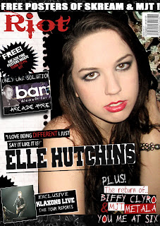
I plan to use a female as the headliner of the magazine. I have created a rock magazine so my photos will play a big part in creating the rock theme for the magazine. In my research of music magazines I find the common front covers use close up shots of the artists to show clearly who they are. For my front cover I plan to use a close up of a single female, dressed in dark contemporary clothing. She will also be wearing striking makeup, (bright red lips and dark black eyes) and jewellery to fit in with the celebrity culture.
I plan to use many pictures in my contents page as they are used as teaser photos to invite a reader into the magazine. I will use some photos I have taken of live bands, to make it similar to a real music magazine.I will use a mixture of mid shots and long shot photos to show all the different types of artists there are inside this magazine.
For my double page spread I plan on using a medium long shot which usually shows an entire person head to foot. This gives me the oppurtunity to show much more of the environment, the background.
The above title won the least amount of votes for audience favourite. The feedback received of this title was thatit lacked boldness and 'wow factor'. However, I believe this title is unique with lower case and upper case letter contrast making it fun and different. Perhaps, this font does not suit the rock grungy style of my magazine though. |
Contents- Editors letter
I have the best news for Green day fans right now. They are finally touring the UK the news we’ve all been waiting for! I’ll be hanging out experiencing the tour, so come and say hi! If you can’t wait to find out where they are and their support acts turn to page 22! It may be the only chance to see the rockers, so be quick. Also there’s so much going on this week, from best performer Plan B (page 20) to the legends Led Zeppelin (page 48). There are plenty of new bands trying to make it big this week, and we have got them to show you. From hardcore metal bands to a cool classic rock sound, there is a good mix. Listen to their sound online then email us at feedback@riot.com and let us know your verdict!
See you around!
See you around!
This is the text I will use for my editor's letter, it is relevant to the genre of a rock magazine and has a similar content to other editor letters in music magazines.
Subscribe to:
Comments (Atom)


